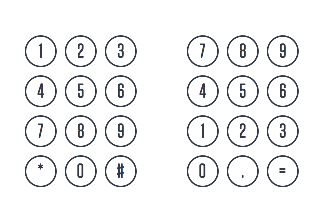
UX Design: “There’s no logical reason why telephones and calculators use different numeric keypads. So why do we still follow the same convention? Picture the keypad of a telephone and calculator side by side. Can you see the subtle difference between the two without resorting to your smartphone? Don’t worry if you can’t recall the design. Most of us are so used to accepting the common interfaces that we tend to overlook the calculator’s inverted key sequence. A calculator has the 7–8–9 buttons at the top whereas a phone uses the 1–2–3 format…”
Accurate, Focused Research on Law, Technology and Knowledge Discovery Since 2002

Sorry, comments are closed for this post.