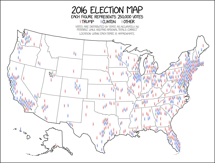
Economist Alan Cole via his Twitter post: “So what I like about this map is that gives an accurate sense of the popular vote, and an accurate sense of how both coalitions are actually distributed throughout the country. It is the most elegant and informative election map I have seen..

Sorry, comments are closed for this post.